Think about watching your favorite home renovation show. When they finally reveal the finished product, one of the most wow-worthy parts of the new space is often the color of the walls, floors, and kitchen cabinets. Have you ever wondered how those designers magically pick the perfect colors to go together in a home? Often the colors they choose are part of a color palette, or a set of colors that compliment each other in different ways. These same color combinations are an essential part of creating beautiful publications – including your yearbook!

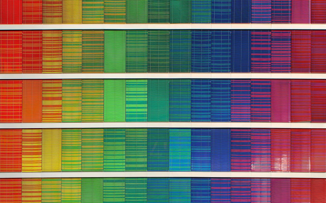
Choosing color palettes for your yearbook can be a daunting task, but it is one of the most important. After all, color can be used to convey emotion, create unity, add personality, and more! You don’t need to be a master designer or color expert to create a great palette that elevates your yearbook – we’re here to give you the knowledge and confidence you need to make color decisions like a pro.

Palettes 101: The Color Basics

COLOR WHEEL

The color wheel is exactly what it sounds like – a round wheel that consists of every color in the rainbow. We’ll use this tool to highlight where different palettes live on the color wheel.

MONOCHROMATIC

A monochromatic color palette is one where the whole palette is based off of one core color. For example, a monochromatic color palette would be one with five different shades of blue. We see a lot of monochromatic gray color palettes in modern home design (hello, Chip and Joanna!). Use a monochromatic palette for a sophisticated, modern book design.

COMPLIMENTARY

A complimentary color palette uses colors across from each other on the color wheel. Red + green, orange + blue, and yellow + purple are all complimentary color palettes. This is where the different shades and tints (darker and lighter options) of a color become important — the coral + turquoise palette that is super on-trend right now is a great example because both those colors are tints/shades of red + green. As long as the colors belong to complimentary “main” colors (called hues), the shade or tint you choose doesn’t matter. Feel free to play around!

ANALOGOUS

An analogous color palette is one where the colors in the palette are all right next to each other on the color wheel. Think red + orange + yellow, green + blue + purple, and so on. These palettes can be great for establishing a “warm” or “cool” look within your book, since most analogous colors fall in either the warm or cool side of the color wheel. These palettes can create an effortless look of unity and coordination.

TRIAD

A triad color palette contains three colors that are equidistant from each other on the color wheel. Red + yellow + blue (the primary colors) is a great triad color palette option for elementary schools because it is so fun and bright! Remember that you can pick different shades and tints of colors to create a palette, so experiment and find what works for your book.

NEUTRAL

A neutral palette is all neutral colors – not very fun, right? Adding an accent color can liven things up and pull the look together. The gray + yellow nursery palette trend going on right now is a great example!

How do I use color in my yearbook?
Grade-ient: Assign different colors to different grades.
Section Star: Use color to designate different sections of your yearbook such as student life, clubs, sports and more!
Thematic: Try sticking to one color theme in School Annual Online.
Feature It: Draw readers’ eyes to what you want to stand out – pick a color that pops off the page and assign it to your feature content.
Unify: Use a color palette on your cover and throughout your pages to give the yearbook a sense of unity and coordination.
Team Spirit: Assign different colors to individual sports teams, clubs or activities.
School Annual has lots of great color options to choose from in our School Annual Online palettes. Try scrolling through all the color options and practice making the perfect palette!

Want more #designinspo? Download our free color palette guide to have of beautiful pre-designed yearbook color palettes right at your fingertips! You’ll be designing like an HGTV star in no time.

We’re here to help make a meaningful yearbook that will end up in the hands of every student, all while providing you a fun and hassle-free yearbook experience. We promise to make your experience with School Annual easy, fun and affordable.